Web · 01 / 05
Be Your Light - Website Redesign
A calm redesign and SEO-safe move off WordPress for a holistic studio.

Task & concept
Be Your Light is a holistic studio in Novi Sad - Reiki treatments and training, sound massage and sound baths, energy psychology - run by a Reiki Master teacher and author. The old WordPress site had grown the usual way: a separate page for every service, a theme working against the content, and no single place that told a visitor what to do next. It also had something worth protecting - first-page Google positions for local searches like sound massage and Reiki courses in Novi Sad.
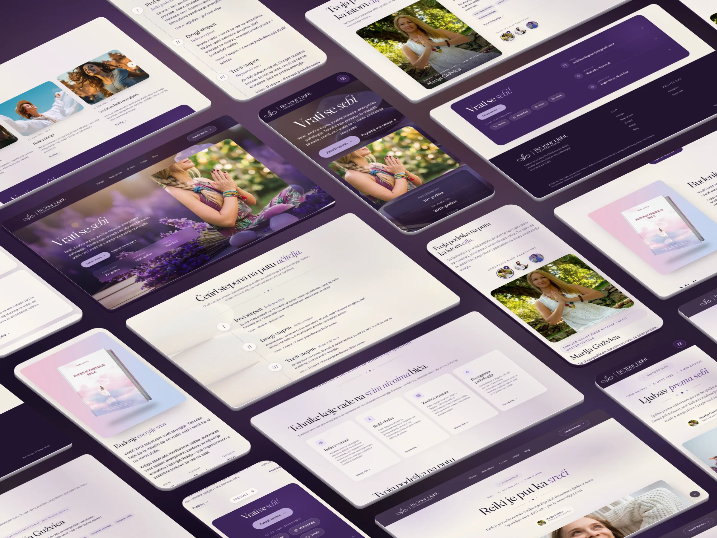
The site was redesigned as one calm page with a single action. It opens on “Return to yourself”, shows the four services as cards that open into detailed modals, introduces the founder and the team, lays out the four Reiki levels as a vertical path, and moves on to the book, the blog and a contact card - with every section leading to the same “Book a session” button and a short form. The look is a quiet palette of plum, lilac and warm cream, with soft photography, a headline that writes itself in and gentle reveals that respect reduced-motion settings.


Under the new look it is a migration, not just a reskin. The site is plain HTML, CSS and JavaScript - no CMS and no plugins - with the front-end coded through AI-assisted development. The six blog posts keep their old addresses and were edited, given clear subheadings and linked to the services they talk about; the old service pages redirect to the matching section of the new page; and every page got new titles, descriptions, sharing images and structured data.


- Information architecture
- One page instead of a dozen: services, team, Reiki levels, book, blog and contact - each leading to the same “Book a session” button.
- Visual system
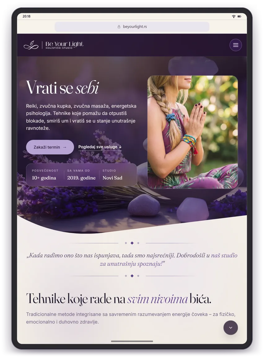
- Plum, lilac and warm cream - soft, unhurried and easy to read on any screen.
- SEO migration
- Blog posts kept on their old URLs, old service pages redirected to the matching service, new titles, sharing images and schema.
- Responsive
- Checked in iPhone, Samsung S25 Ultra, iPad and MacBook previews and on touch, with two-column layouts made for tablets.