Packaging & Label · 04 / 07
Fitogal Body Scrub
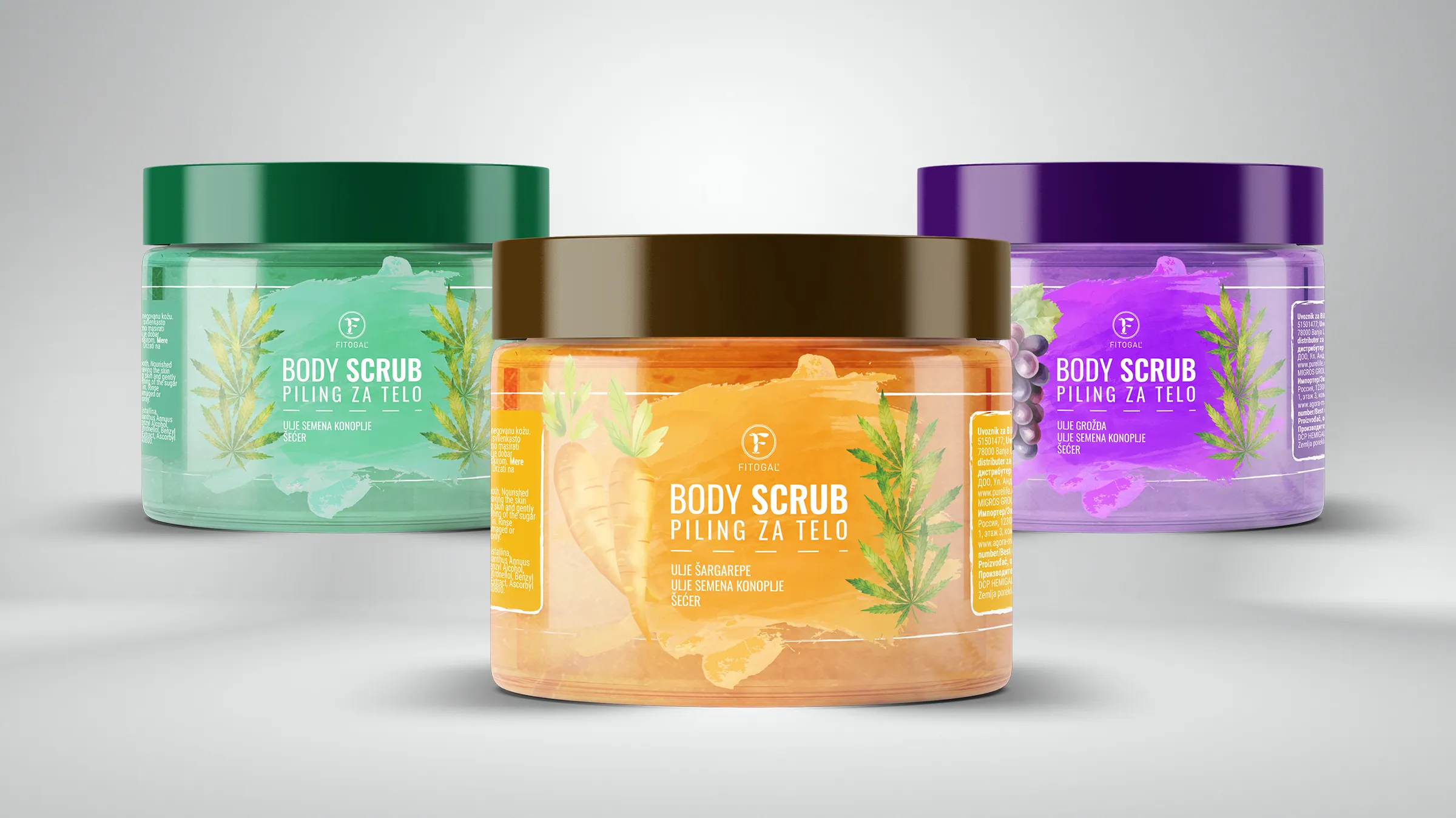
A transparent label, so the product's own colour tells the variants apart.
Task & concept
The task was to design a label for a scrub line in three variants - carrot, grape and hemp - that feels natural and handmade while staying part of one recognisable line.
A shared layout holds the series together, while watercolour strokes and ingredient illustrations bring softness and a handmade tone. The transparent label is meant to let the product's own colour take over the job of differentiation.
- Typography
- Bold „Body Scrub“ with a „Piling za telo“ signature, legible over colour.
- Color
- Orange, purple and green-teal, supported by the colour of the product itself.
- Illustration
- Watercolour strokes behind the text and watercolour ingredients (carrot, grape, hemp leaf).
- Label
- Designed as a transparent label, so the content's colour shows. No special finishes, three variants.